We asked AI to design the new 2026/27 Everton home kit – and it gave the most basic design ever
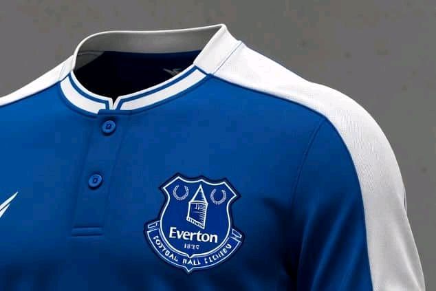
It’s not easy to get an Everton kit wrong — but somehow, Grok managed it.
This is the time of year when supporters look forward to unwrapping a brand-new football shirt at Christmas, and with Everton finally showing signs of life under David Moyes after the grim spells under Sean Dyche, Frank Lampard and Rafa Benítez, fans will be hoping this season’s kit investment finally brings some pride to match the progress on the pitch.
While Everton have experimented with some quirky away and third kits over the years, the home strip has usually remained fairly traditional. This season is no different, featuring subtle wavy hoops in lighter and darker shades across an otherwise all-blue design.
Like most modern kit launches, it attracted criticism online, but history shows that if Everton go on to win silverware or qualify for Europe in 2026, the shirt will quickly become iconic. If not, it will fade quietly into obscurity.
That’s why it’s impressive — in all the wrong ways — that Grok managed to butcher what should be a near foolproof task: designing a royal blue Everton kit.
A design disaster from Grok
Grok describes its effort as “a modern celebration of Everton’s royal-blue heritage with subtle nods to the club’s Victorian origins and the iconic Prince Rupert’s Tower.”
Naturally, it wasn’t going to call its own creation an “absolute monstrosity” — but that’s exactly what it is.
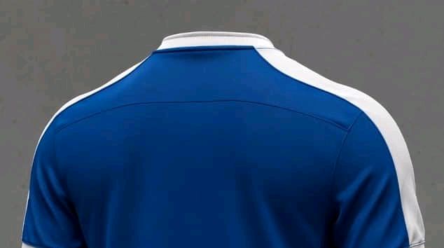
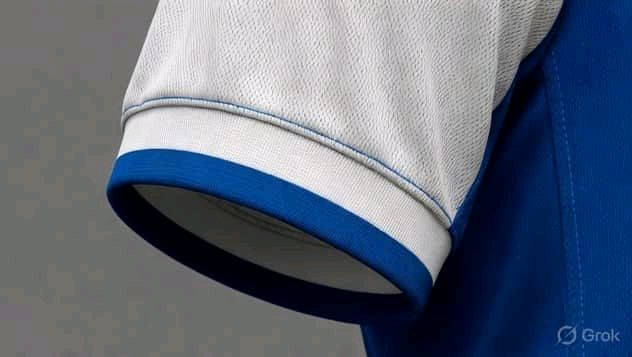
The problems are twofold: the shirt relies on a single design feature, and that feature is dreadful. Grok defends the white shoulders as a “direct homage to the famous 1960s–80s kits and the white-and-blue contrast that defines Everton’s DNA,” seemingly drawing inspiration from the 1985–86 season.
That campaign was successful on the pitch, with Everton winning the Community Shield and finishing runners-up in both the league and FA Cup, helped by Gary Lineker’s lethal finishing.
However, history shows that heavy white detailing simply doesn’t work for Everton kits in the modern era.
The 2000–2002 strip — arguably the club’s worst of the Premier League era — proved that, with its boxy look, white panels, and awkward sleeve striping.
If the white shoulders featured some texture or detailing, it might have helped. Alternatively, adding depth elsewhere could have balanced the design. Instead, the shirt is painfully basic yet still manages to look awful.
As a training top it would be questionable — as a home kit representing Everton for an entire season, it would be nothing short of an embarrassment.
